Process Maps 101
What’s a process map?
A process’s steps/events in a graphic display.
Why use a process map?
Understand how the process actually works.
Can I see an example?
UNI Clinical Assessment Center referral process map
IMRU Shift Change future state process map
process map is a communication tool, first and foremost. As with so many communication tools, it is hard to develop a complex communication that is easy to understand . With that in mind, let’s review the only two rules of process mapping:
1. Clarity is king
The purpose of your process map is to bring clarity to the complex; to make visible that which is invisible. Think your process isn’t invisible? Point to it. If you actually are pointing to something right now, it is certainly a noun: an employee, a patient, your desk. (Kudos if your noun is a process map.) A workplace process is a sequence of actions happening in different places at different times, impossible to see as a whole.
2. Have a purpose
We are often told, “Start with why.” Process mapping is no different; it must have a purpose. If a finished pretty map is the purpose , frame it. Rand McNally won’t drive you to Peoria and a process map won’t fix processes but both are very useful in reaching your goal. However, if you don’t have a goal, neither will be helpful to you. There is something you’re trying to see with this map. Take the time to identify that (those) thing(s) before you begin. Examples of Purpose: We want to see delays. We want to see where defects originate.
Those are the only rules. Everything else is guidance.
Process Mapping Series
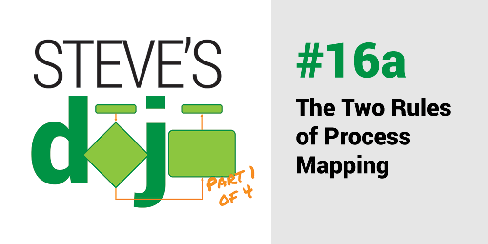
Part 1: The Two Rules of Process Mapping
Part 2: Reasons to Build a Process Map
Part 3: Common Facilitation Challenges When Process Mapping
Part 4: Common Mistakes When Process Mapping
Arrows and diamonds and squares. Oh my.
You don’t have to use a lot of differently shaped boxes. You can. Don’t have to. You could just use rectangles. They were good enough for Piet Mondriaan. Consider Rule 1 and ask how much coding (colors and symbols) your map needs to achieve clarity.
For example, a diamond is the traditional shape to indicate an either/or point in your process. Many map readers understand this and the shape subconsciously prepares them before they ever read the words in the box. On the other hand, there are dozens, perhaps hundreds, of mapping symbols and few people know them all. Don’t expect your map reader to learn a new language before benefitting from your map.
Same with arrows. Red or black, dashed or solid… Only use these if they help your reader. Your process map has a story to tell and with today’s waning attention span, less is more.
Lanes and deciders and streams. Oh my.
What type of map should you build? Processes are best mapped with horizontal ownership lanes; they clearly show ownership changes (which nearly always come with process delays and opportunities for error). These lanes are also inherently understood by the audience and reduce word count. For instance, ownership lanes reduce, “Phlebotomist walks to pt. room,” to, “walk to pt. room.” If you used an arrow box to indicate travel, you could reduce it further; “to pt. room.”
Top to bottom decision trees are commonly used to represent protocols and don’t gain much from ownership lanes.
Value stream maps are often appropriate early in a project when a team is considering the patient value stream (i.e.: from first contact with health system to stasis of the condition). Value stream maps tend to come in two varieties: super simple (no lanes, absolutely minimal branching, just rectangles) and awfully complex (~40 symbols). In deference to Rule 1, we recommend the simple version. Soon after a value stream map is finished, some of its boxes will be detailed with an ownership lane map.
Next time: Reasons to build a process map.
Steve Johnson
To celebrate the New Year, Value Engineer Mitch Cannon applied statistics to weight loss. He was quickly reminded of an important lesson that applies in health care: when you’re trying to improve, don’t overreact to data.
Balancing uncertainty, fear, and emotions isn’t easy — especially in health care. Family practice physician Kyle Bradford Jones looks outside of his practice to identify two common biases that affect how we behave in the face of perceived risk. His key insight? The risk that isn’t directly in front of us may be mistaken for no risk at all.
The dojo welcomes guest author and senior value engineer Will McNett with a deep dive into clinic capacity utilization. McNett borrows from manufacturing to offer a framework to measure and increase what really matters to patients: time spent with their provider.