Trouble Accessing the Reports?
If you are a leader with budgeting responsibilities and cannot access the reports, please submit an IT trouble ticket on Pulse.
hether you lead a cost center (support department) or revenue center (clinical department), your local operations have a ripple effect across the system. Our internal financial reports, varying in size and shape, mirror these ripples and can reveal essential information that contributes to both our local and systemwide strategies.
In this article, we’ll spotlight the four most common financial reports that frontline leaders encounter on a monthly and quarterly basis. By delving in, we aim to empower you to pinpoint areas that demand your attention.
Most Common Financial Reports at University of Utah Hospitals and Clinics
Not sure what some of these words mean?

Read "Finance 101: Basic Terminology" to understand key terms mentioned throughout these reports.
- What is it? The Operating Statement displays a department’s total operating gain (aka bottom line/net) after expenses have been deducted from revenue for a specific period. This financial statement is also known as an Income Statement or a Profit and Loss Statement (P&L).
- Why does it matter to me? This is a high-level representation of your department’s progress toward budgeting goals. This displays various metrics you oversee and offers insight into where your attention is needed, based upon the actuals and your base budget. It can also offer insight into whether or not you may consider adjusting your budget moving forward, based on consistent trends.
- Where do I find it? This is found on sharepoint and the S Drive under Financial Statements. Operating statements are also found in Strata Management Reporting.
- When do I look at this? Leaders are advised to review this around the 14th of each month when it is produced to make sure everything looks accurate.
- What do I look for when I’m there?
- Look for unfavorable variances, provided in parenthesis, as they indicate your department may not be on track to reach the threshold set for a specific metric.
- You can jump into your Strata comment dashboard to document possible reasons behind the variances.
- Step-by-step instructions are provided in our STRATA Management Reporting and Operating Budget Training on Pulse.
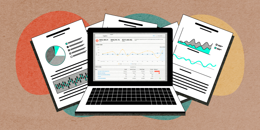
- What is it? As an organization, we are more commonly utilizing this interactive version of the Operating Statement in Strata, known as the comment dashboard, for visualizing variances. This dashboard creates an improved user experience for Management Reporting.
- Why does it matter to me? Similar to the Operating Statement, this is a high-level representation of your department’s progress toward budgeting goals. As a leader, you know your department best and can speak to what’s happening locally that may be creating variances. It too can offer insight into whether or not you may consider adjusting your budget moving forward, based on consistent trends.
- Where do I find this? The link to Strata is found on the Hospital Finance Operating Budget Pulse page.
- When do I look at it? Leaders will be notified by email around the 14th of each month with notice of any variances within their department. Reviewing this regardless of email notification after the 14th is recommended to ensure everything looks how it should.
- What do I look for when I’m there?
- Look for unfavorable variances, as they indicate your department may not be on track to reach the threshold that has been set. Metrics listed in the left column and those with red bars require documentation with reasoning behind the variance.
- In the graph, the brackets surrounding the blue line indicate the threshold with where you want the actuals (orange line) to be. Anything outside of the brackets is considered a variance needing further explanation or understanding.
- Step by step instructions are provided in our STRATA Management Reporting and Operating Budget Training on Pulse.
- What is it? The labor efficiency reports display variances in relation to dollars and hours worked per department (org ID). Labor is considered as total salaries and wages.
- Why does it matter to me? The reports display departments in which staff worked more or less hours than planned, which has created a variance in dollars expected to be paid. This information can help ensure staffing under your jurisdiction is meeting set labor targets as well as identify if additional or replacement position requests are warranted.
- Where do I find this? These dashboards are found in Tableau.
- When do I look at it? Leaders will be notified by email around the 20th of each month with notice the dashboard is available for review. Clicking on the link provided in the email will take you directly to the dashboard.
- What do I look for when I’m there?
- In both the hours worked view and the labor dollars view, look for unfavorable variances with a red background which indicate attention and/or improvement is needed.
- Green variances in both the hours worked view and labor dollars view, means you’re on track of meeting your set targets.
- In the labor dollars view, green variances combined with ODB (Vizient Operational Data Base) Benchmarking scores of 50th percentile or better are ideal for position request approvals. The closer to 0% you are, the better.
- What is it? The Vizient Operational Data Base (ODB) highlights operational characteristics of departments in comparison to other similar departments across the nation. Characteristics that are compared include labor (productivity) and expenses (department costs).
- Why does it matter to me? This offers insight into how your department is performing in comparison to others, which provides opportunities for praise, improvement, and cost reduction. Depending on where your benchmarks lie in the percentiles, it can also support efforts in warranting additional resources or positions and evaluating efficiency.
- Where do I find this? These dashboards are found in Tableau.
- When do I look at it? Leaders will be notified by email on a quarterly basis with notice of dashboard availability. Clicking on the link provided in the email will take you directly to the dashboard.
- What do I look for when I’m there?
- Green data points represent favorable metrics meeting the set target and possess an opportunity for praise and scaling.
- Yellow data points represent unfavorable metrics with potential to reach either the top percentile or lower percentile.
- Red data points represent unfavorable metrics that have opportunities for improvement.
- Benchmarks need to be at or better than the 50th percentile to support a position request. The closer to 0% you are, the better.
Leaders and their teams have a significant role in identifying opportunities for improvement through the stories depicted in their local finance reports. Our Central Finance team is happy to help guide you through these reports and answer questions so you feel confident utilizing them.
Clint Reid
Casey Moore
Robert Dickson
Navigating budgets and finance can be a daily responsibility for managers, which is not always an easy task. Finance experts Casey Moore and Robert Dickson share the importance of and best practices for Management Reporting and how it can help you become a better leader.
The annual Operating Budget is a structured process that pairs frontline manager expertise with powerful financial forecasting tools to help the organization stay on track. The Central Finance Team’s Casey Moore and Robert Dickson demystify the process to help you navigate budget season.
Finance can provoke anxiety among professionals, many of whom were never trained in finance, yet now find themselves responsible for contributing to the overall financial well-being of our system. Finance leaders Casey Moore and Clint Reid offer a basic vocabulary to help establish a shared financial language at University of Utah Health.