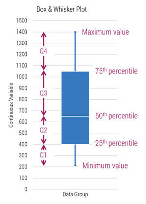
 What is a box and whisker plot?
Box and whisker plots are distributions and convey the same information as a histogram but with less precision. Instead of dividing the data into bins, box and whisker data is restricted to four quartiles.
In a box and whisker plot, the lengths of the quartiles contain information. In the example here, notice Q2 is much smaller than Q3. This relationship is showing the 25% of the data falling in Q2 has a range of 250 (400-650). Q3 also contains 25% of the data but has a bigger range of 400 (650-1050). (As we shall see, minimum and maximum are sometimes not used, so Q1 and Q4 aren’t always true quartiles.)
Why do I need a box & whisker plot?
Let’s say you have a dataset that contains Visit ID, Cost, six DRGs, three Providers, and Discharge Day of Week, and you want to discover which process variables are influencing variation in your output variable (in our case, cost).
The pairing of histogram and run chart is the go-to variation visualization of a continuous dataset, but if you want to see variation within and between groups, box and whisker plots are also a great option. They allow side-by-side contrast of distributions on a single graph. You could build six histograms to compare six DRGs, but to do so would require your readers to shift their eyes all over the page.
| Histogram | Box & Whisker | |
|---|---|---|
| Type of data | Continuous | Continuous |
| Bin width | Set by you | Restricted to four groups (quartiles) |
| Great for... | Visualize variation of a single variable | Visualize variation within and between variables |
Quick review of quartiles:
The minimum datum to the 25th percentile is the Q1 and contains the lowest 25% of your data. The 25th to 50th percentile is Q2, and so on. The range between the 25th and 75th percentiles (Q2 & Q3) is known as the interquartile range (IQR) and contains the middle 50% of your data.
How do I construct a box and whisker plot (sometimes shortened to “box plot”) in Excel 2013 or lower? Excel 2016 has a box and whisker function, and I’ll update this post when it becomes available to us.
To create a box and whisker plot, you could use this online box and whisker plot generator by Shodor. It’s not very visually appealing, but it’ll give you a correct answer in a pinch.
How Do I Do It?
Instructions to build a box and whisker for DRGs in Excel 2013:
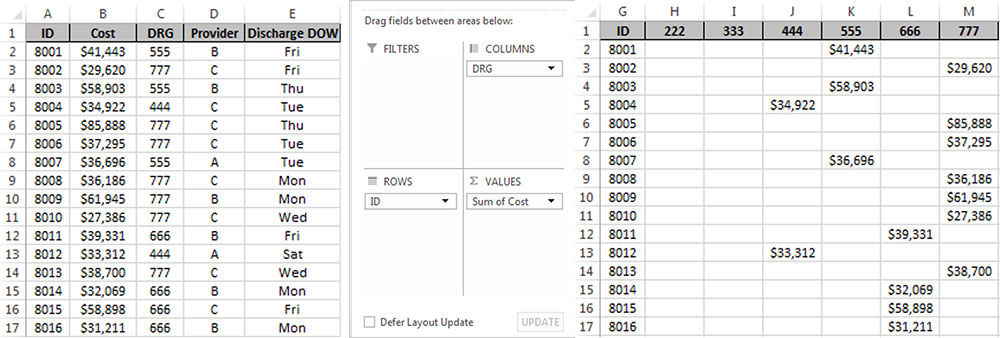
1. Restructure the data with a pivot table to separate the DRGs from the left image to right.
2. Build this table:
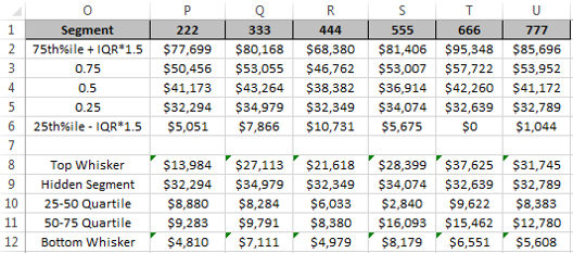
With these formulas (written just for fictional DRG 222)
- P2: =P3+1.5*(P3-P5)
- P3: =PERCENTILE.INC(H$2:H$397,$O3)
- P4: =PERCENTILE.INC(H$2:H$397,$O4)
- P5: =PERCENTILE.INC(H$2:H$397,$O5)
- P6: =IF(P5-1.5*(P3-P5)<0,0,P5-1.5*(P3-P5))
- P8: =IF(MAX(H$2:H$397)>P2,P2-P3,MAX(H$2:H$397)-P3)
- P9: =P5
- P10: =P4-P5
- P11: =P3-P4
- P12: =IF(MIN(H$2:H$397)<P6,P5-P6,P5-MIN(H$2:H$397))
(More on the scary formulas in P8 and P12 next week.)
Rows 1-6 contains the actual results. Rows 8-12 are here to help Excel help us. We’re going to use Excel’s built-in error bars as our whiskers. Please note: The whiskers in our plot do not represent statistical error; we’re just borrowing them for our needs.
3. Insert a 2-D stacked column graph using rows 9-11. It won’t look much like a box and whisker plot at this point.
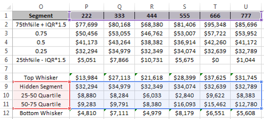
4. Add the whiskers:
Select the top segment. Click Chart Tools → Design → Add Chart Element → Error Bars → Standard Error. Now format the error bars by right-clicking on one in the graph and choose Format Error Bars. Select Plus, Cap, and Custom with the radio buttons.
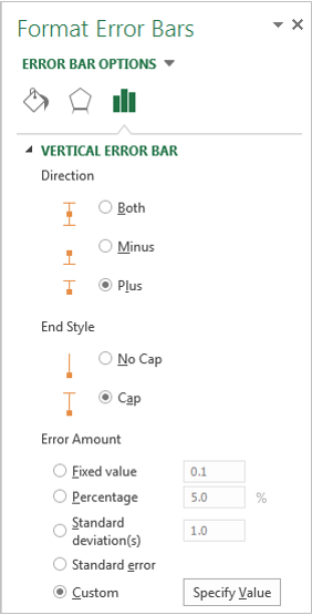
Click Specify Value → click the button next to Positive Error Value and select P8:U8. This was just for the upper whisker.

To insert the lower whiskers, select the bottom segment of the stacked column. Click Chart Tools → Design → Add Chart Element → Error Bars → Standard Error. Right click on the whisker, choose Format Error Bars. Select Minus, Cap, and Custom. Click Specify Value → click the button next to Negative Error Value and select P12:U12.
5. Hide the “hidden segment” by formatting it with no border and no fill.
6. Delete the legend.
7. Format your graph to taste.
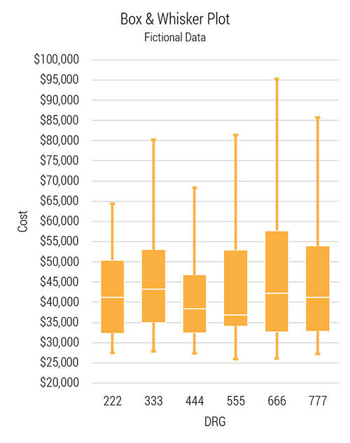
The resulting graph should look something like this.
Check YouTube for video tutorials.
Next week, we’ll use multiple box and whisker plots to explore the variation of multiple variables and I’ll talk about whisker length a bit more.
Steve Johnson
Hospitalist Ryan Murphy introduces quality improvement (QI): The systematic and continuous approach to improvement.
Improvement science is about making everyday tasks easier and faster. This week, Steve uses the 6-phase value improvement methodology to build a highly-reliable morning routine.
This week, Steve describes a genius (yet simple) data collection tool: the check sheet. Colline Prasad and the SSTU nursing team used check sheets in their work reducing call lights, a project that turned out to be a triple-win; an intervention that improved patient perception of responsiveness, increased patient safety, and decreased nurse distraction.
