Learning Objectives
After reading this article, you will be able to:
(1) define process mapping
(2) identify when to use a process map
3) develop a low-tech process map
Case Study
Kevin Curtis inherited a problem that had been hanging around for years.1 Psychiatric patients in the emergency department were waiting too long for a bed at the University Neuropsychiatric Institute (UNI)—sometimes as much as 8 hours. Curtis engaged his team by using Utah’s value improvement methodology and value engineer Dane Falkner to create process maps—visual tools for improvement. They refined their process map into a cause-and-effect diagram. Using the visual diagram they identified that information flow from the transferring facility was causing delays. It was a breakthrough. Curtis and team designed a new process that organized the information into smaller batches based on when the information was needed. After three weeks of implementing the new process, wait times dropped from 3.8 hours to 1.6 hours, and four-out-of-five transfers were completed in under an hour. The best part? They were able to fine-tune their existing process without adding additional work.
What is process mapping?
rocess mapping is a visual representation of a workflow that identifies each step in a process to clarify how the work is done.
Process mapping is used to highlight issues and where the process is breaking down in the workflow. Process maps make it easier to communicate the current or future state of the process you are hoping to improve.
When do I use a process map—and why?
Process maps can be used to visualize unclear processes and identify areas of improvement (future improvement efforts), or as part of your baseline analysisBaseline analysis defines the current state of a problem both quantitatively and qualitatively. A process map is a qualitative tool to allow a team to “see” a process.” at the beginning of an improvement effort you are working on. Process mapping is useful when you don’t know where to begin improving, or when you are not sure what the cause of the problem is.
When you don’t know where to begin. Teams often start with a problem and jump to finding a solution. A map of the current state of a process can help confirm what actually needs to be fixed. Sometimes, however, it may reveal the opposite: it’s not a problem (or at least not the big one). By confirming the problem early, you can avoid sinking hundreds of hours into a fruitless effort.
When you don’t know the cause. Sometimes the problem is well established, but the source is unknown. A process map can help clarify where the process breaks down, which can help focus your efforts.
How do I map a process?
I. Getting started
- Have a plan. Before you begin, start by asking these two questions: What process problem are we trying to solve? What are we trying to see?2 For example, are there delays? Errors? The Seven Wastes are a useful tool to help clarify what you might be looking for.
- Go and see the process. Make sure that what you’re mapping is the actual process. In Lean, this is called going to the Gemba—"the real place" in Japanese. By observing and documenting the process in action, you increase the accuracy of your map.
- Include the team. Process mapping is a team sport. By including the people who actually use the process, you increase accuracy—and improve buy-in down the road when you have a process change to implement.
- Keep it simple. Workflows can be extremely complex, but your map needs to be easy to understand. At the beginning, it helps to capture enough of the action that people can easily follow the process. You can always add greater detail later as needed.
II. Tools you can use
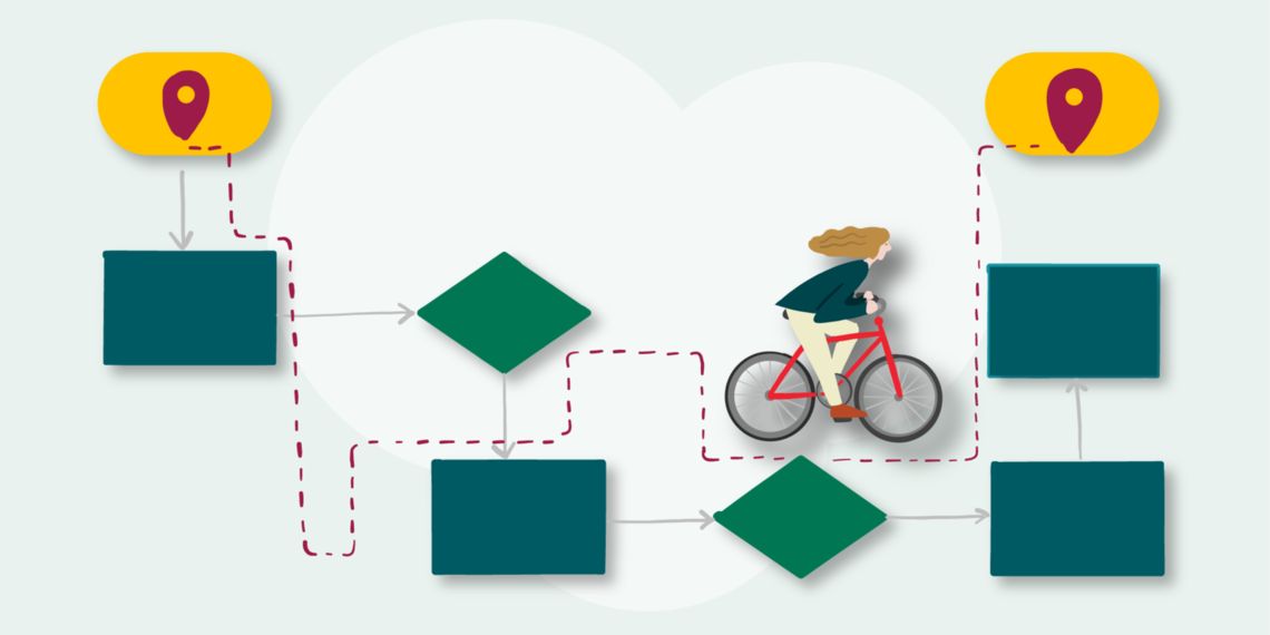
Low-tech. Keep it no-tech by starting with Post-It notes or a whiteboard. If you don’t have those, a piece of paper will work just fine.

It can be an energetic and fun process when a team collaborates to build a map. A group effort can result in a messy, but closer to accurate, depiction of the work.
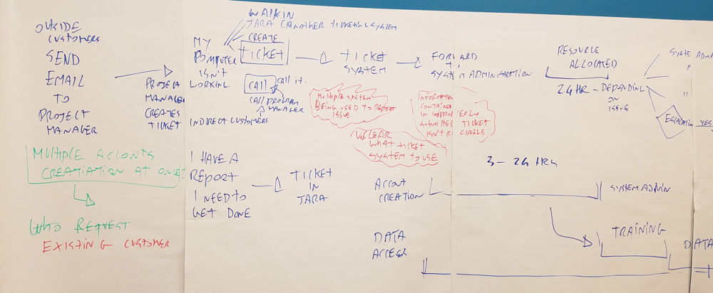
Snap a photo with your phone for a quick copy to work from.
High-tech. If you have to communicate your process beyond your team, it helps to clean up the work. There are many software and web-based tools you can use. Here are just a few:
- PowerPoint — commonly seen and easy to present from, PowerPoint (PPT) allows you to create a custom map using basic flowchart symbols
- Vizio — produces professional grade flowcharts (Note: Not compatible with Mac)
- Lucidchart — web-based product that has a free account option sufficient to develop a high quality process map
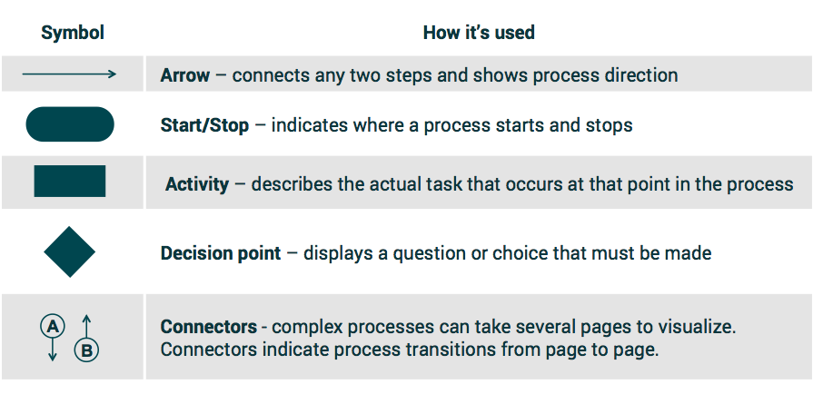
III. Symbols and such
There are dozens of symbols you can use to reflect a process. The table below defines the five most common.
See it in Action
Returning to our intro case study, Kevin Curtis and team first examined the current state of their process and identified each step. Horizontal lanes (below left) indicate the process owners.
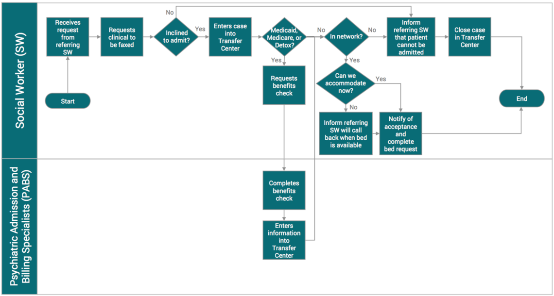
They then worked with value engineer Dane Falkner to identify opportunities for improvement indicated by the little spikey yellow cloudsAlso called Kaizen clouds. Kaizen is the Sino-Japanese word for improvement.. Using the visual diagram they identified that a fax from the transferring facility was causing the delays.
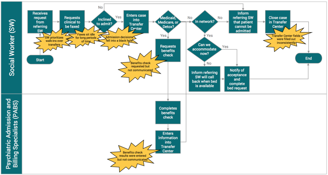
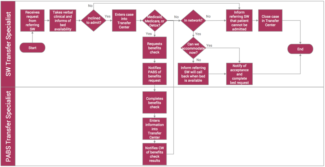
Curtis and team designed a new process that organized the fax’s information into smaller batches based on when the information was needed. This map reflects the future improved process state.
Conclusion
Process maps, like the one Curtis and team helped create at UNI, break down complex work into transparent steps that are more understandable. They make the knowledge of who is doing the work clear and they focus your improvement efforts to help save you time. By mapping each person’s role and the work involved in every transfer and admission, UNI created a revised process that reduced admission time. Admissions are now more predictable and regular, and the eight-hour waits are gone.
References
- Johnson S, Ransco M, Daniels C, Falkner D, Curtis C. How UNI Decreased Delay to Admission (And Improved Team Engagement). Accelerate University of Utah Health, Case Study. 23 June 2017.
- Johnson S. Value Improvement Leaders (VIL): Course Archives, VIL #9: Process Mapping.
*Originally published September 2019
Luca Boi
Internal medicine residents Brian Sanders and Matt Christensen team up with senior value engineer Luca Boi to explain why investing your time honing a well-defined problem statement can pay dividends later in the ultimate success of a QI project.
Hospitalist Ryan Murphy introduces quality improvement (QI): The systematic and continuous approach to improvement.
Many people ask, “What am I supposed to report?” or “Does this count?” Hospitalist Ryan Murphy explains the basic vocabulary of patient safety event reporting, informing the way we recognize harm and identify and report threats to safety.