 These round charts fail at depicting the proportional relationship of values because, geometry. The human mind has a hard time comparing weird areas. We can tell bigger from smaller pie pieces (ordinal scales) but we can’t tell how much bigger or smaller (interval scales). Bar charts make it easy for your reader by providing a useful scale.
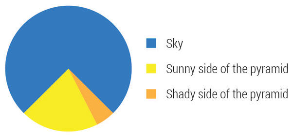
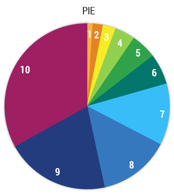
Look at this pie chart and estimate the size of slice 5 compared to slice 9.
QUIZ: How much bigger is category 9 than category 5? Make sure you estimate with one decimal precision. E.g. 2.7. (ANSWER4.0x)
Now repeat the quiz with this bar chart.
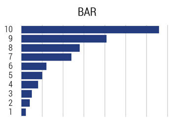 QUIZ: How much bigger is category 9 than category 5? Make sure you estimate with one decimal precision. E.g. 2.7. (ANSWER4.0x)
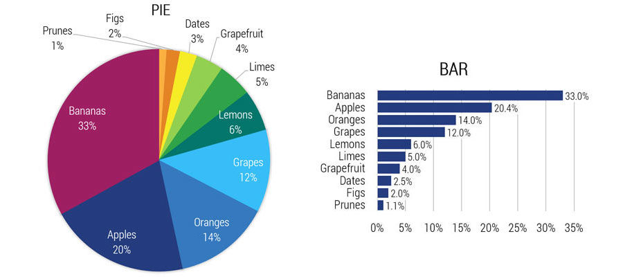
Did you notice the pie chart requires more real estate, communicates lesser information, with chromatic chaos?
But let’s be fair. You would, of course, add labels (category names and values) and we’ll go monochrome.
I think the pie chart lost ground.
The prune and fig slices are inches away from their labels, and overall the pie chart is bigger than it was before while the actual pie is smaller to fit in all the labels. The many colors remain; no one wants a monochrome pie chart.
What’s the area of a circle?
Pi R-squared.
No they aren’t. Pie are round. Cakes are squared.
By the way, a stacked bar chart is a rectangular pie chart...sort of a cake chart, as the joke would indicate. With rectangles, the scaling issue isn’t as bad, but because each datum in the bar has a different floor it again becomes a game of estimation for the reader. In some cases, the weaker utility of the scale is outweighed by better conveyance of related information.
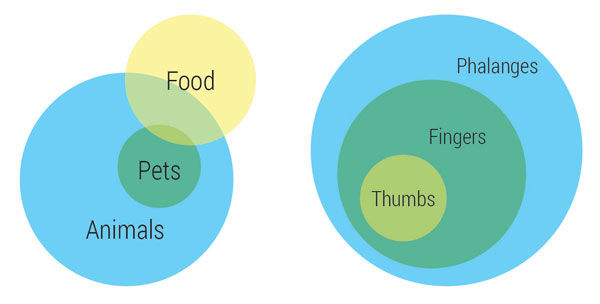
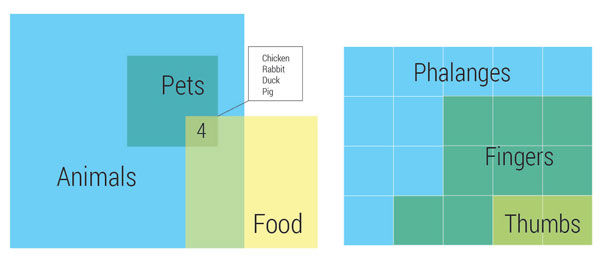
Venn diagrams have a similar challenge as pie charts with a similar solution.
Here’s a partial Venn diagram related to that pie/cake joke.