What is frequency analysis?
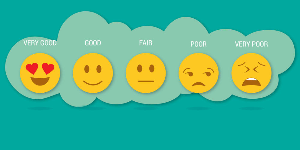
The distribution of responses from very poor to very good in Press Ganey patient satisfaction surveys.
few years ago, I met with a team of nurses and techs in Endoscopy. They were struggling to improve their low patient experience percentile ranking.
Here is the conversation:
Kirk: How do you feel about the experience you are giving to your patients?
Team: We give really great care to our patients and our patients are happy.
Kirk: What if I told you that you are scoring in the 60th percentile?
Team: [saddened] I guess we are not providing great service to patients.
Kirk: What if I told you that you are scoring in the 60th percentile but most of the patients are happy with their care?
Team: [confused] What?? How is that possible?!?
It’s easy to be confused if you only look at the percentile rank. The percentile rank doesn’t help you have a conversation about creating experiences for patients. Frequency analysis is a way to help better understand your patients' experience.
The Power of Frequency Analysis
While the percentile ranking shows you where you compare with others, the frequency analysis shows how patients answered each question. On the outpatient medical practice survey, patients can select 1 (very poor), 2 (poor), 3 (fair), 4 (good), or 5 (very good) on many different questions. The frequency report displays the number of 1s, 2s, 3s, 4s, or 5s for each question.
Often, you’ll find that patients are not marking ‘very poor’ or ‘poor.’ They’re giving you 4’s, or ‘good.’ They are saying the care is good, just not ‘very good.’ They are not unhappy, they are just telling us the care is inconsistent.
How to Engage Staff Around The Frequency Analysis
I wanted to create conversation with the staff, so I made a matrix for my team to visualize how each patient answered the survey. Each week, I would look at the frequency distribution for those questions and put a ‘frowny’ or ‘smiley face’ (this was pre-emoji days) in the column to represent a patient who gave us that rating. My team was now ready to have the conversation about the difference between a good versus very good experience.
Information About Delays - Goal 80% Very Good:
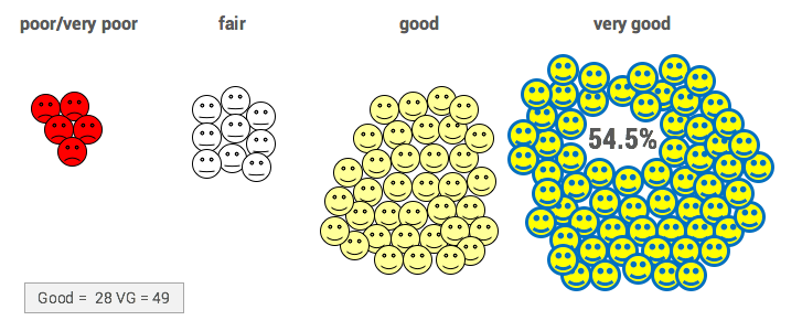
Each face represents a patient, and that’s important. I wanted the staff to remember that every person matters. Patient experience is about delivering a consistent experience for every patient.
Focusing on ‘good’ and ‘very good’ can really change the conversation with your staff and positively engage them in the data.
Want Your Frequency Analysis Report?
- Log in to Press Ganey and select InfoEDGE from the reports dropdown.
- Make report selections (including your service and site).
- Under Options & Formats check the Frequency and n checkboxes. Need more help? Call or email Chris Brown at 5-7461 or Brandon Swensen at 7-3627.
Kirk Hughs
Chrissy Daniels shares three powerful insights from Dr. Danielle Ofri’s new book, “What Patients Say, What Doctors Hear.” Ofri combines research and storytelling to explain the power of patient-doctor conversation and the common pitfalls that undermine connection and trust. She concludes the ear may be the most powerful tool in medicine.
In Ghana, Value Engineer Cindy Spangler, surgeons Kate Smiley and Marta McCrum found that patient safety rests on simple ideas that are hard in practice.
A step-by-step discussion of the 7 elements of suicide care.