dojo 5b box and whisker
improvement
Box and Whisker Plots (Part 2)
Part 1 was on how to build a box and whisker plot. In Part 2 we're defining whisker length and visualizing variation within and between the variable groups. This time we're giving you answers to the questions no one has asked.

Visualizing Variation

The last post was about building a box and whisker plot. This post is about defining whisker length and visualizing variation within and between the variable groups.

We’re still using our dataset containing Visit ID, Cost, six DRGs, three Providers, and Discharge Day of Week.

Remember, a box and whisker plot is a distribution.

dojo 5b 1 box whisker

In this example, the upper quartile is much taller than the three lower quartiles in this dataset, suggesting a right skewed distribution. I’ve included the right-skewed histogram of the same dataset to demonstrate the relationship. The red dashed lines are there to demonstrate the same scale.

On whisker length

Let’s look again at those complex formulas defining the whisker lengths:

P8 (Upper Whisker): =IF(MAX(H$2:H$397)>P2,P2-P3,MAX(H$2:H$397)-P3)

P12 (Lower Whisker): =IF(MIN(H$2:H$397)<P6,P5-P6,P5-MIN(H$2:H$397))

These formulas choose the whisker values that best represent the distribution, either IQR*1.5 or min/max. The simple min/max method can be misrepresentative because minimums and maximums are often outliers. In the two graphs here I show the simple IQR*1.5 method and the simple min/max method.

dojo 5b 2 box whisker

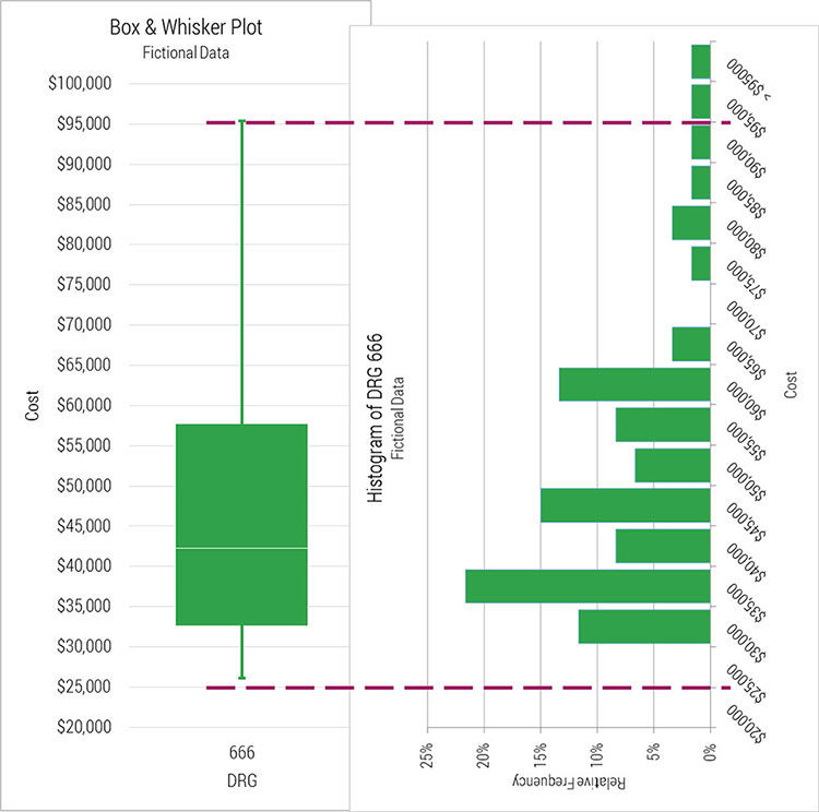
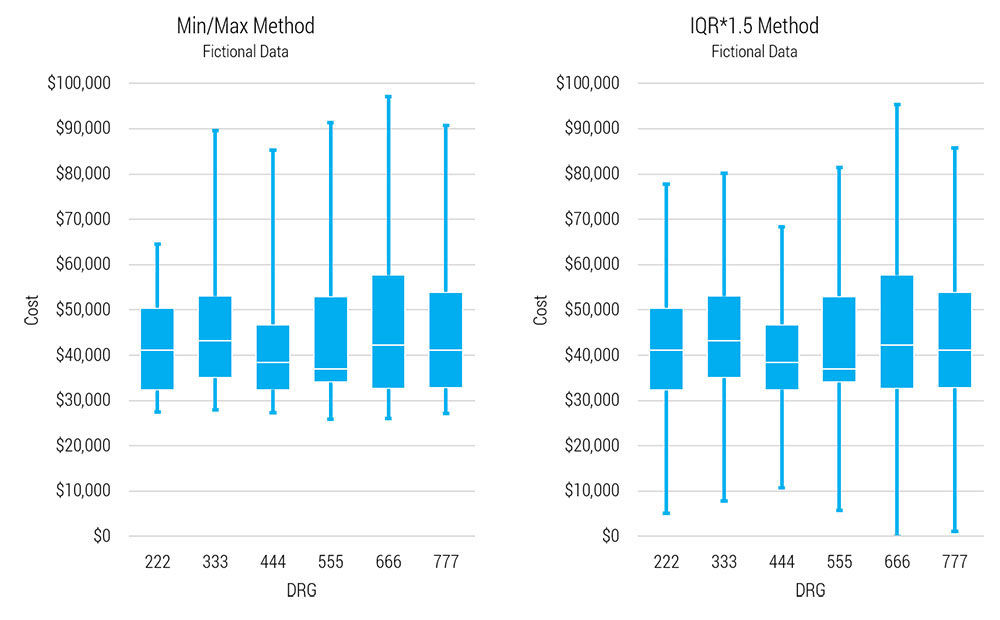
Notice the minimums (left graph) of the separate DRGs are tight ($25,895 - $27,868. Range = $1,972). The IQR*1.5 method (right) is a gross misrepresentation of the lower quartiles, but in the upper quartiles it’s the maximums which are misrepresenting the data; five of six DRGs’ maximums are outliers. That is, in the upper quartile, the IQR*1.5 method is better. Those complex formulas select the best representation in each case.

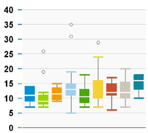
The default method in BOE is even better. It expands on this logic to set the upper whisker at the minimum datum that’s less than (75th %ile + IQR*1.5) and then it shows any higher data as outliers. And it works in reverse in the lower whisker. Here’s an example I pulled from a BOE scorecard. Those little circles are outlier cases. The groups in this case are calendar quarters allowing the reader to look for trends over time, but because they’re box & whisker plots, the reader can also study distributions of any single quarter.

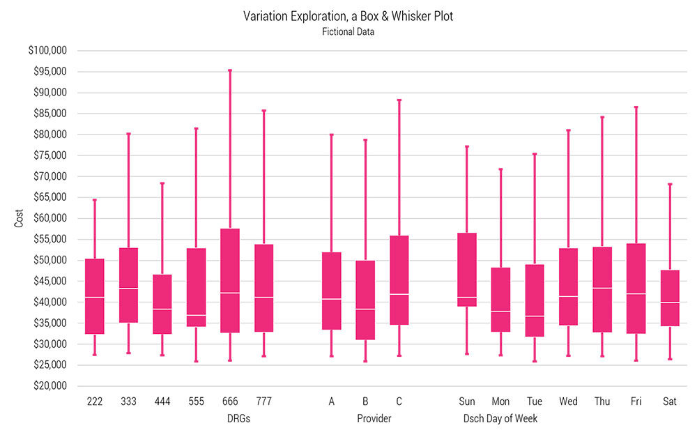
Last week we examined just the DRG group. If you took this analysis one step further you could compare the variation among the six DRGs without depending on point estimates like standard deviation. Box & whisker plots were born for this.

These three plots, side-by-side and set to the same scale, help visualize variation within and between groups.

dojo 5b 4 box whisker

There are many observations to be made about the fictional dataset with this one graph:

  • The variable with the greatest variation is DRG; lowest is provider.
  • Cases discharged on Mon and Tue are the only group with medians below $40K.
  • Sat discharges appear to be significantly less expensive that Sun discharges. A two sample t-test could confirm.
  • Top quartile cases tend to get more expensive as the week progresses.
  • The upper quartiles tend to be much taller than the lower quartiles, suggesting a right skewed distribution across the entire dataset. I’ve included the right-skewed histogram of DRG 666 to demonstrate the relationship.
  • The upper quartiles are the most variable with spans ranging from ~$14K (222) to ~$37K (666). We don’t see this variability between any other quartiles.
  • The two middle quartiles of each DRG are fairly balanced except in 555 which has a very tight second quartile.
  • The medians all hover around $40K with a range of around $6K.
  • DRG 222 has the tightest dispersion and is similar to 444; 666 has the widest.
  • 333, 555, and 777 share similar distributions.
  • There seems to be a natural cost floor around $27K.

If this were real data, our rather simple exploration exercise would certainly influence the direction of a project.


Contributor

Steve Johnson

Director, Value Engineering, University of Utah Health

Subscribe to our newsletter

Receive the latest insights in health care equity, improvement, leadership, resilience, and more.