
UUHC Evidence Based Practice & Wellness Champions
Poster Fair 2024
Hospital Atrium + Level A bridge to Moran
May 13-17 | Poster displays
May 15, 10:00-Noon | Leadership Reception - come cheer on your team!
Celebrate the impact of local improvement and well-being efforts showcased during this 4-day poster fair and leadership reception.
2024 Poster Fair Website | Submit Abstract by Apri 26 | Final Poster due May 8
Tip 1: Craft an attention-grabbing title
Viewers typically read the title of a poster first before looking at other sections, so it should stand out and draw people in. The title should also accurately and concisely describe the project or research.
Tip 2: Think brief
The goal of your poster is to visually communicate the highlights of your work in less than three minutes. Phrases, organized in bullet points or within graphics, are preferred. Limit the use of sentences and paragraphs.
Remember: the blurbs are your talking points of reference. Don’t list everything you did or want to say on the poster. Just the highlights! Use notes and knowledge to fill in the rest.
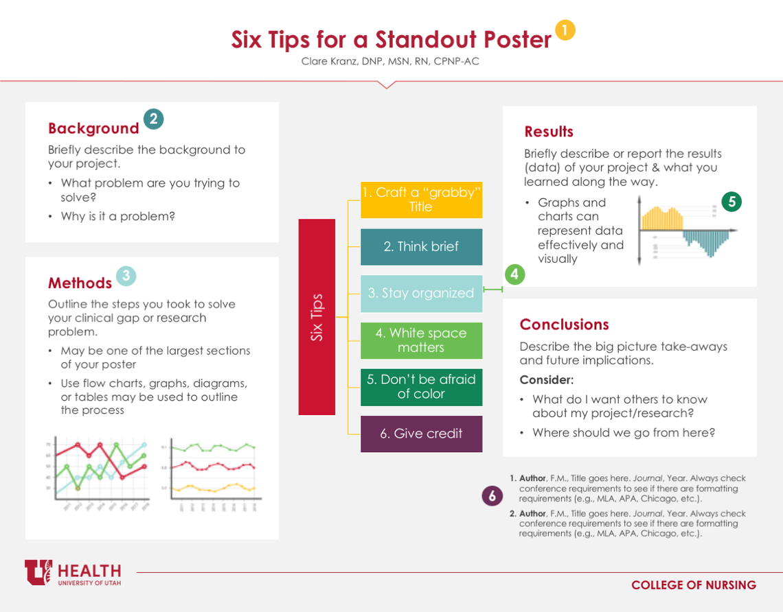
Tip 3: Stay organized
Check with your organization to see if a pre-approved poster template is preferred (We've included a few U of U Health templasts in this post). Next, use your abstractA concise, text description of your work. May be required when submitting your poster for consideration at a conference or for a publication. to fill in the sections of your poster:
- Introduction/Background: Introduce the background to your project or research. Think: “What problem are you trying to solve?” and “Why is it a problem?”
- Methods: The methods section outlines the steps you took to solve your clinical gap or research question. Flow charts, diagrams, tables, and graphs may be used to depict your process. The methods may be one of the larger sections of your poster.
- Results/Discussions: Briefly report the results of your project and discuss what you learned along the way. Charts and graphs can represent data effectively and visually.
- Conclusions: Describe the big picture takeaway from your project implementation or research, as well as future implications. Consider: “What do you want others to know?” and “Where do we go from here?”
Tip 4: White space matters
White spaceWhite space is the portion of your poster left unmarked: margins, gutters, and space between columns, lines of type, graphics, figures, or objects drawn or depicted. A lot of white space (free, unmarked space) is highly desirable. helps define the flow of the poster and draws important information to the forefront. Avoid overcrowding text, graphs, and pictures. Approximately 40% of your poster should be white space—it your poster visually appealing and easy to read from a 4-6 foot distance. Professional posters are typically read from left to right or up to down.
Tip 5: Don’t be afraid of color
Complementary color themes (colors opposite each other on the color wheel) enhance poster interest and appeal. Pick a color theme (preferably 2-3 colors) and stick with it. Again, your organization may have a poster template with pre-assigned or approved colors. It is best to use a white or light colored background, a dark font for contrast, and pops of complementary colors. Graphics and pictures should be simple, clean, and directly relate to your project points.
Tip 6: Give credit
List all authors or primary contributors. Author names and credentials should be near the title of the poster, typically at the top. If you have an improvement project, the team is a significant part of the equation: health care improvement is a multidisciplinary team sport. Be sure to identify every individual who was involved in achieving improvement.
Acknowledgements should include sponsoring institutions or grant funders (i.e. U of U Health). These can be added as logos. Put them in the corner(s) of the poster or along the bottom (if you have multiple). Use the official branding logo from the institution/organization. Click here to view and download University of Utah Health logos.
Finally, don’t forget citations when necessary. Often, but not always, citations are needed for pictures and graphics or for the background information. Full reference sections are not necessary for a poster, but should be available upon request.
Check out some poster examples below:


Bonus tip: Take note
Peer feedback is critical when creating posters. Feedback should be provided by all contributing authors, and colleagues or peers can provide additional input. Busy posters tend to put off viewers because it is difficult to parse out the major themes. Common complaints include: crowded text, too many/too few colors, and misrepresented information. Keep your posters simple and bring detailed information/notes with you to discuss the details of your project with viewers.
Content updated March 12, 2024. Original post date: Feb. 25, 2020.
Additional Resources:
Research Poster Design: Visual Thinking (EHSL U of U Health) A quick lesson in design basics for any project or publication.
Evidence Based Practice Poster Fair: Past Posters (EHSL Digital Publishing) See examples from past U of U Health Poser Fairs.
Join the #BetterPoster movment (Center for Open Science) A series of templates to download and choose from.
Clare Kranz
The hard work of improving value includes leading and engaging a team. Two improvers, Emily Carlson and Dr. Lauren Wood, share how they kept their teams engaged throughout a long (and sometimes inconclusive) improvement process.
To disagree means failing to agree. Synonyms include to contradict, challenge or debate. Synonyms do not also have to include to argue, quarrel, dispute, bicker or clash. Pediatric intensivist Jared Henricksen shares the best path forward when words become clouded with emotion.
When it comes to work, collaboration is key, but do we really know what good collaboration looks like or how it functions? Director of Organizational Development Chris Fairbank shares the importance of investing in collaboration and how to sustain a culture of effective collaboration.